The terms ‘visual language’ or ‘vocabulary’ are typically used to describe the distinct characteristics of an artisthttp://www.tate.org.uk/artist-rooms/collection/themes/artist-rooms-theme-language’s practice. This employment of words is apt within the context of modern and contemporary art, since the use of written or spoken word has been a significant feature of artists’ practices since the early twentieth century. The use of letters and words in artworks is traditionally associated with authorship – the artist’s signature or inscription, often towards bottom of a painting or drawing.
Street and graffiti artists have always been using the power of letters and written words to attract attention of distracted bystanders, hungry for meaning and significance. For graffiti lettering it all began with letters and symbols scrawled on public surfaces, and when one looks at the work created by ten creators featured on the following list, it becomes clear how those markings evolved in beautiful and unexpected ways over the years. Some of them explore the beauty of lettering itself by creating complex and almost mystical calligraphic images, while others strive with great passion to achieve more simple, yet deeply philosophical use of typography as a vehicle to convey their messages.
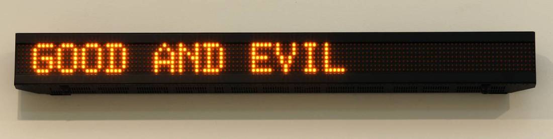
Jenny Holzer (born July 29, 1950, Gallipolis, Ohio) is an American neo-conceptual artist, based in Hoosick Falls, New York. The main focus of her work is the delivery of words and ideas in public spaces.
Holzer belongs to the feminist branch of a generation of artists that emerged around 1980, looking for new ways to make narrative or commentary an implicit part of visual objects. Her contemporaries include Barbara Kruger, Cindy Sherman, Sarah Charlesworth, and Louise Lawler.
Lately, I’ve been exploring the use of text in my artwork. Many artists employ text – I’m thinking about artists like Joseph Kosuth, Ed Ruscha, Jasper Johns, Cy Twombly, etc. And recently I was introduced to the work of photographer, Idris Kahn and quickly discovered his artwork as well. Kahn, a London based artist, uses large stamped lines of text in his work. The text is inspired by Nietzsche. There’s something really compelling about Kahn’s work and I keep coming back to it again and again.
Hans Haacke‘s work questions systems of power and can be nicely packaged in the blanket of institutional critique. His most attractive piece is Shapolsky et al. Manhattan Real Estate Holdings, A Real Time Social System, as of May 1, 1971 (1971), an abstracted infographic linking a wealthy land owner (Shapolsky) to buildings he purchased. I haven’t seen it in a while, but it painted the guy as a slumlord and really dug into the shell companies used to purchase the land indirectly. It caused quite a stir at the time, and the Guggenheim refused it for Haacke’s solo show (possibly due to his politicizing a tie with the Guggenheim’s Board).
Martin Creed (born 1968) is a British artist and musician. He won the Turner Prize in 2001 for Work No. 227: The lights going on and off. Creed lives and works in London.
Lawrence Weiner (born February 10, 1942) is one of the central figures in the formation of conceptual art in the 1960s.
His work often takes the form of typographic texts.
The Weiner works in the ARTISTROOMS collection consist of a cycle of ten wall texts; each statement such as Tied Up in Knots 1988 and Roughly Ripped Apart 1988 suggests a physical action or invoke the manipulation of an object or matter. Weiner regards his language works as sculptures, and they can be seen as instructions or propositions that could be enacted. These works are displayed as vinyl lettering applied directly to the exhibition surface. The artist’s aim is to offer a universal, objective experience in which the reader is invited to execute the work through his or her own imagination.
Weiner began his career as an artist as a very young man at the height of Abstract Expressionism. His debut public work/exhibition was at the age of 19, with what he called Cratering Piece. An action piece, the work consisted of explosives set to ignite simultaneously in the four corners of a field in Marin County, California. That work, as Weiner later developed his practice as a painter, became an epiphany for the turning point in his career.[6] His work in the early 1960s included six years of making explosions in the landscape of California to create craters as individual sculptures.[7] He is also known during his early work for creating gestures described in simple statements leading to the ambiguity of whether the artwork was the gesture or the statement describing the gesture: e.g.”Two minutes of spray paint directly on the floor..” or ” A 36″ x 36″ removal of lathing or support wall…” (both 1968). In 1968, when Sol LeWitt came up with his Paragraphs on Conceptual Art, Weiner formulated his “Declaration of Intent” (1968):
1. The artist may construct the piece.
2. The piece may be fabricated.
3. The piece need not be built.
Each being equal and consistent with the intent of the artist the decision as to condition rests with the receiver upon the occasion of receivership.
Works form the early twentieth century where appropriated words, letters and symbols were increasingly incorporated, such as Francis Picabia’s The Fig-Leaf 1922 and Kurt Schwitters’s Mz.299 1922, reflected the emerging avant-garde movements of the time. This period also saw an increasing presence of the printed word in the urban landscape and the developing sophistication of marketing and advertising.
The Italian artist Mario Merz began using neon in 1966, his neon texts were often juxtaposed against everyday objects as is the case with Che Fare? 1968-73. The words ‘Che Fare’ in neon resemble handwriting sunk into a pot of wax that melts under the heat of the neon. Che Fare translates as ‘What is to be Done?’ taken from the title of a political pamphlet produced by Russian revolutionary Vladimir Lenin in 1902. The text is widely regarded as advocating a political party to promote Marxism within the working classes and has come to define the drama of an individual’s engagement in modern society.
DIRTY BABY 1977 Edward Ruscha born 1937 ARTIST ROOMS Acquired jointly with the National Galleries of Scotland through The d’Offay Donation with assistance from the National Heritage Memorial Fund and the Art Fund 2008 http://www.tate.org.uk/art/work/AR00058
BLUE PURPLE TILT 2007 Jenny Holzer born 1950 ARTIST ROOMS Acquired jointly with the National Galleries of Scotland through The d’Offay Donation with assistance from the National Heritage Memorial Fund and the Art Fund 2008 http://www.tate.org.uk/art/work/AR00082
TIED UP IN KNOTS 1988 Lawrence Weiner born 1942 ARTIST ROOMS Acquired jointly with the National Galleries of Scotland through The d’Offay Donation with assistance from the National Heritage Memorial Fund and the Art Fund 2008 http://www.tate.org.uk/art/work/AR00136
In the Cloud 1991 Richard Long born 1945 ARTIST ROOMS Acquired jointly with the National Galleries of Scotland through The d’Offay Donation with assistance from the National Heritage Memorial Fund and the Art Fund 2008 http://www.tate.org.uk/art/work/AR00143
Che Fare? 1968-73 Mario Merz 1925-2003 ARTIST ROOMS Acquired jointly with the National Galleries of Scotland through The d’Offay Donation with assistance from the National Heritage Memorial Fund and the Art Fund 2008 http://www.tate.org.uk/art/work/AR00598
La Brea/Art Tips/Rat Spit/Tar Pits 1972 Bruce Nauman born 1941 ARTIST ROOMS Acquired jointly with the National Galleries of Scotland through The d’Offay Donation with assistance from the National Heritage Memorial Fund and the Art Fund 2008 http://www.tate.org.uk/art/work/AR00607
For the lecture: The social organism – a work of art, Bochum, 2nd March 1974 1974 Joseph Beuys 1921-1986 ARTIST ROOMS Acquired jointly with the National Galleries of Scotland through The d’Offay Donation with assistance from the National Heritage Memorial Fund and the Art Fund 2008 http://www.tate.org.uk/art/work/AR00621
Michelle weaves traditional and digital forms with overlooked domestic objects, tracing memory, belonging, and displacement as metaphors for her own lived journey. Her work is an invitation to feel and remember, to unmask what lies beneath, and to step into the visibility of being seen.
View all posts by shesafineartist